- Published on
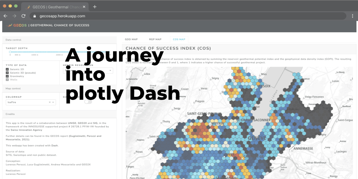
A journey into plotly Dash
- Authors
- Name
- Lorenzo Perozzi
- @lperozzi


Overview
Plotly Dash is a productive Python framework for building web analytic applications. It is fairly easy to use, and allow to create awesome web applications. Written on top of Plotly.js and React.js, Dash is ideal for building and deploying data apps with customized user interfaces in pure Python. Plotly's Python is a free and open-source graphing library that makes interactive, publication-quality graphs and maps. A series of tutorials and tips about fundamental features of Plotly's python are available here.
Dash It's particularly suited for anyone who works with data. Dash apps are rendered in the web browser. You can deploy your apps to VMs or Kubernetes clusters and then share them through URLs. Since Dash apps are viewed in the web browser, Dash is inherently cross-platform and mobile ready. To see the potential of Dash look at the Dash App Gallery.
This article will show how to use plotly Dash to create a simple GIS webapp similar to the GECOS app developed by the GE-RGBA group of the University of Geneva.
About
So, we have a nice geodataset, we have made a great analysis on it and we want to disseminate the results. One way is to plot the result on a map. One awesome example is the Switzerland's regional income (in-)equality map made by Timo Grossenbacher using the ggplot2 R package. This is nice for printed communication such as journal or infographics but we cannot interact with the data.
To display multiple dataset GIS software such as QGIS offers lots of (advanced) tools. However they have two main limitations:
- the user needs to have an installed version of the GIS software,
- due to their steep learning, only GIS professional will really use it.
Instead, Web GIS applications allow us to disseminate the results to a broader audience, including public users who may know less or nothing about GIS, such as Governments/Administration/public stakeholders, in a user friendly way that is specifically designed for simplicity, intuition, and convenience, making it typically much easier to use than desktop GIS.
Dataset
The dataset used is similar to the one used in the GECOS web app however, due to permission limitations it has been slightly modified. It contains 6 columns:
====  =======  =======  ============  ============  =======  =====
  ..        X        Y  MEASUREMEN      TARGET DEP    SCORE    COS
====  =======  =======  ============  ============  =======  =====
   0  6.05173  46.1659  Gravimetry            3000        5      1
   1  6.05175  46.165   Seismic 2D             500       20     40
   2  6.05178  46.1641  Seismic 2D            2000       20      5
   3  6.0518   46.1632  Seismic 2D            1000       15     49
   4  6.05302  46.1659  Gravimetry            3000        5      8
====  =======  =======  ============  ============  =======  =====
The target is to map SCORE and COS column in Dash. Here coordinate are already in EPSG:4326; however usually we need to convert from local projection (for Switzerland this is often EPSG:2056) to global Mercator projection. In this I showed how to do that.
Dash app
packages and data
The Dash python packages are:
import dash
from dash.dependencies import Input, Output, State
from dash import dcc
from dash import html
In addition import dash_bootstrap_components as dbc has been used. Dash-bootstrap-components is a library of Bootstrap components for Plotly Dash, that makes it easier to build consistently styled apps with complex, responsive layouts. Another very useful resource for the app layout is Dash Bootstrap Theme Explorers.
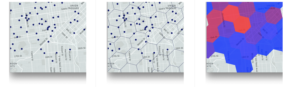
Then we need to import the Plotly python library for graphing. Here there is a list of available Maps we can create with Plotly and Mapbox. We are interested to create an Hexagonal Binning density map. This technique allows aggregating points into hexagon as the following images show and it is particularly useful for visualizing large numbers of points.

The plotly package we need for hexbin map is:
import plotly.figure_factory as ff
then we also need:
import pandas as pd
import numpy as np
import math
import geopandas as gpd
especially pandas will be used to import and apply a few operations to the data.
App layout
After importing all the necessary package, we start the app:
app = dash.Dash(__name__,
                external_stylesheets=[dbc.themes.LUX],
                title='GEOMAAP.io | Hexbin Map example',
                meta_tags=[{'name': 'viewport',
                            'content': 'width=device-width, height=device-height, initial-scale=1.0, maximum-scale=1.2'}]
                )
where the meta_tags arguments allow controlling the size of the app component through different devices size.

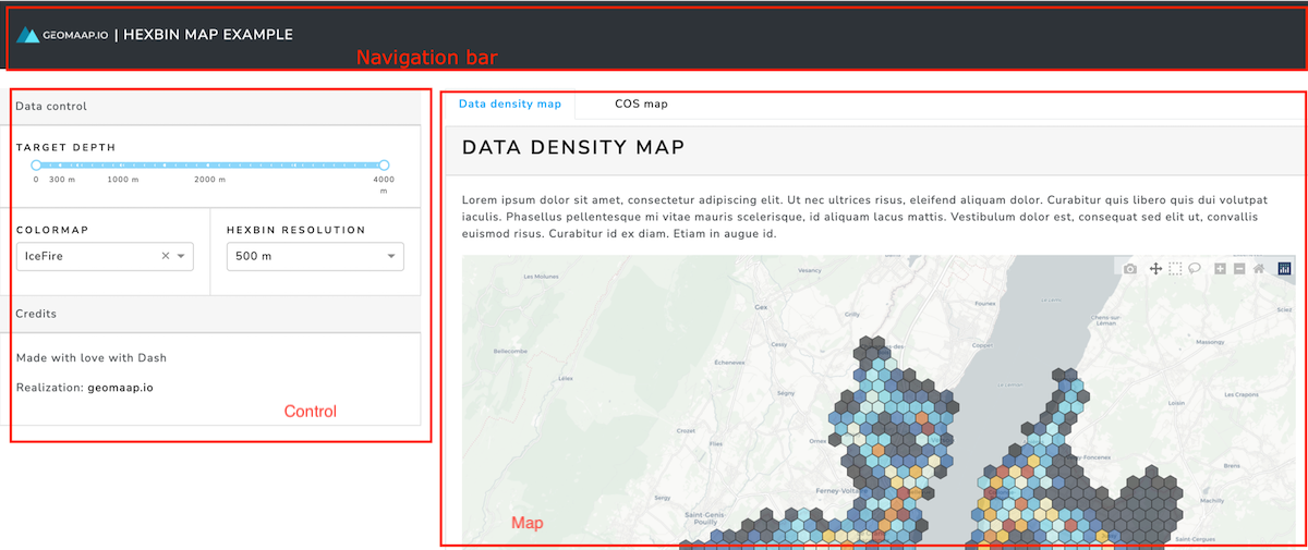
Navigation bar
The navigation bar represents the title of the application. Thanks to the dash bootstrap components package, we can use dbc.Row and dbc.Col to subdivide the layout. For the Navbar we have a row and two columns representing the logo and the title:
navbar = dbc.Navbar(
    [
    html.A(
            # Use row and col to control vertical alignment of logo / brand
            dbc.Row(
                    [   dbc.Col(html.Img(src=LOGO, height="30px")),
                        dbc.Col(dbc.NavbarBrand("| Hexbin Map example", className="ml-2")),
                    ],
                    align="center",
                    no_gutters=True,
                    ),
            href="https://blog.geomaap.io/about",
        ),
    ],
    color="dark",
    dark=True,
    className="mb-4",
)
Control layout
The control layout is where we interact with the map. Dash core components allow for interactive user interfaces. For this tutorial we used a mix of Dash core components and dash bootstrap components library that makes it easier to build responsive layouts. In particular, we used RangeSlider, Dropdown, and Markdown components, inside Card bootstrap components.
The range slider for targeting the depth of investigation:
# Range Slider
targetdepth_tab = dbc.Card(
    dbc.CardBody(
    [
        html.H6("Target depth"),
        dcc.RangeSlider(
            id='TargetDepth',
            marks={
                0: {'label': '0', 'style': {'fontSize': "0.6rem"}},
                300: {'label': '300 m', 'style': {'fontSize': "0.6rem"}},     # key=position, value=what you see
                500: {'label': '', 'style': {'fontSize': "0.6rem"}},
                1000: {'label': '1000 m', 'style': {'fontSize': "0.6rem"}},
                1500: {'label': '', 'style': {'fontSize': "0.6rem"}},
                2000: {'label': '2000 m', 'style': {'fontSize': "0.6rem"}},
                3000: {'label': '', 'style': {'fontSize': "0.6rem"}},
                4000: {'label': '4000 m', 'style': {'fontSize': "0.6rem"}},
                },
            step=20,                # number of steps between values
            min=0,
            max=4000,
            value=[0,4000],     # default value initially chosen4
            dots=True,             # True, False - insert dots, only when step>1
            allowCross=False,      # True,False - Manage handle crossover
            disabled=False,        # True,False - disable handle
            pushable=2,            # any number, or True with multiple handles
            updatemode='mouseup',  # 'mouseup', 'drag' - update value method
            included=True,         # True, False - highlight handle
            vertical=False,        # True, False - vertical, horizontal slider
            verticalHeight=900,    # hight of slider (pixels) when vertical=True
            className='None',
            tooltip={'always_visible':False,  # show current slider values
                    'placement':'bottom'},
            ),
]
    )
)
The colormap choice and hexagon resolution:
# Colormap choice and Hexbin resolution

colorscale_names = ['Greys','RdBu','Viridis','Magma','Jet','IceFire']

control_tab = dbc.CardGroup(
    [
        dbc.Card(
            dbc.CardBody(
                [
                    html.H6("Colormap"),
                    dcc.Dropdown(
                        id='colorscale',
                        options=[{"value": x, "label": x}
                                for x in colorscale_names],
                        value='IceFire',
                        style={'margin-bottom':'10px'}
                    ),
                ]
            ),
         ),
        dbc.Card(
            dbc.CardBody(
                [
                    html.H6("Hexbin resolution"),
                    dcc.Dropdown(
                        id="resolution",
                        options=[
                            {'label': '300 m', 'value': 300},
                            {'label': '500 m', 'value': 500},
                            {'label': '750 m', 'value': 750},
                            {'label': '1000 m', 'value': 1000},
                            {'label': '2000 m', 'value': 2000},
                        ],
                        value=500,
                        clearable=False
                    )
                ]
            )
        ),
    ]
)
and the card with some text:
credits_tab = dbc.Card(
    dbc.CardBody(
        dcc.Markdown(
            """
            Made with love with Dash

            Realization: [geomaap.io](https://blog.geomaap.io/about)

            """
        ),
    ),
    className="mt-0",
)
Map layout
The right side of the app is where the hexbin maps are visualized. A convenient way to visualize different maps without decreasing their size is by using self-contained tabs component:
We first define the density and chance of success (cos) map components:
data_density_map_component = dbc.Card(
    [
    dbc.CardHeader(
        html.H3("Data density map")),
        dbc.CardBody(
            [
            dcc.Markdown(
                """
                Lorem ipsum dolor sit amet, consectetur adipiscing elit. Ut nec ultrices risus, eleifend aliquam dolor. Curabitur quis libero quis dui volutpat iaculis. Phasellus pellentesque mi vitae mauris scelerisque, id aliquam lacus mattis. Vestibulum dolor est, consequat sed elit ut, convallis euismod risus. Curabitur id ex diam. Etiam in augue id.

                """
            ),
            dcc.Graph(
                id='data_density' ,
                style={'height': 800},
                ),
            ],
            style={'padding':'0.5'}
        )
    ],
    className="my-2",
    style={'height': 980}
)
data_cos_component = dbc.Card(
    [
    dbc.CardHeader(
        html.H3("Data density map")),
        dbc.CardBody(
            [
            dcc.Markdown(
                """
                Lorem ipsum dolor sit amet, consectetur adipiscing elit. Ut nec ultrices risus, eleifend aliquam dolor. Curabitur quis libero quis dui volutpat iaculis. Phasellus pellentesque mi vitae mauris scelerisque, id aliquam lacus mattis. Vestibulum dolor est, consequat sed elit ut, convallis euismod risus. Curabitur id ex diam. Etiam in augue id.

                """
            ),
            dcc.Graph(
                id='data_cos' ,
                style={'height': 800},
                # responsive=True
                ),
            ],
            style={'padding':'0.5'}
        )
    ],
    className="my-2",
    style={'height': 980}
)
And we then make a tabs component:
fig_tab = dbc.Tabs(
    [
    dbc.Tab(data_density_map_component, label="Data density map",active_label_style={"font-weight":"800","color": "#00AEF9"}),
    dbc.Tab(data_cos_component, label="COS map",active_label_style={"font-weight":"800","color": "#00AEF9"}),
    ]
)
Finally, we put all the individual components together, where the left layout occupies 4/12 (width=4) columns and the right layout (maps) 8/12 (width=8) columns:
app.layout = dbc.Container(
    [
        navbar,
        dbc.Row(
            [

            dbc.Col(  # left layout

                [
                dbc.CardHeader("Data control"),
                targetdepth_tab,
                control_tab,
                dbc.CardHeader("Credits"),
                credits_tab,
                ],
                width=4),

            dbc.Col( # right layout
                [
                fig_tab,
                ],
                width=8,
            ),
            ]
        ),
    ],
    fluid=True,
)
App callbacks
The last part (but the most important) part of a Dash application are the callback functions: functions that are automatically called by Dash whenever an input component's property changes, in order to update some property in another component (the output). To better understand how callback functions this is a very good start.
We have two maps and 3 components to interact with each map. We then need two callback functions as:
@app.callback(
    Output('data_density', 'figure'),
    [
     Input('resolution', 'value'),
     Input('TargetDepth', 'value'),
     Input("colorscale", "value"),
    ]
)
def update_data_density(resolution, depth, scale):

    dff= cos.copy()
    dff = dff[(dff["TARGET DEP"] >= depth[0]) & (dff["TARGET DEP"] <= depth[1])]
    heg_size = -1* ((dff.X.max() - dff.X.min()) / resolution * np.pi / 180 * earth_radius  * np.cos(dff.Y.mean()))
    heg_size = math.floor(heg_size)  # define hegsize dimension


    fig_data_density = ff.create_hexbin_mapbox(
        data_frame=dff,
        lat="Y", lon="X",
        nx_hexagon=heg_size,
        opacity=opacity,
        labels={"color": "Density index"},
        color="SCORE",
        agg_func=np.sum,
        mapbox_style='carto-positron',
        color_continuous_scale=scale,
        show_original_data=False,
        original_data_marker=dict(opacity=0.6, size=4, color="black"),
        min_count=1,
        zoom=10.5,
        center= {"lon": 6.13, "lat": 46.22}
        )

    fig_data_density.update_layout(
        margin={"r": 0, "t": 0, "l": 0, "b": 0},
        showlegend=False,
        coloraxis_showscale=False,
        hoverlabel=dict(
            bgcolor="#3a3a3b",
            font_color='white',
            # color='white',
            font_size=16,
            font_family="Nunito Sans"
        )
    )
    fig_data_density.data[0].hovertemplate = "<span style='font-size:1.2rem; font-weight=400'>Data density index = %{z:,.0f}</span><br><br>"

    return fig_data_density

###################################
######  Cos Map ########
###################################


@app.callback(
    Output('data_cos', 'figure'),
    [
     Input('resolution', 'value'),
     Input('TargetDepth', 'value'),
     Input("colorscale", "value"),
    ]
)
def update_data_cos(resolution, depth, scale):

    dff= cos.copy()
    dff = dff[(dff["TARGET DEP"] >= depth[0]) & (dff["TARGET DEP"] <= depth[1])]
    heg_size = -1* ((dff.X.max() - dff.X.min()) / resolution * np.pi / 180 * earth_radius  * np.cos(dff.Y.mean()))
    heg_size = math.floor(heg_size)  # define hegsize dimension


    fig_cos = ff.create_hexbin_mapbox(
        data_frame=dff,
        lat="Y", lon="X",
        nx_hexagon=heg_size,
        opacity=opacity,
        labels={"color": "Density index"},
        color="COS",
        agg_func=np.sum,
        mapbox_style='carto-positron',
        color_continuous_scale=scale,
        show_original_data=False,
        original_data_marker=dict(opacity=0.6, size=4, color="black"),
        min_count=1,
        zoom=10.5,
        center= {"lon": 6.13, "lat": 46.22}
        )

    fig_cos.update_layout(
        margin={"r": 0, "t": 0, "l": 0, "b": 0},
        showlegend=False,
        coloraxis_showscale=False,
        hoverlabel=dict(
            bgcolor="#3a3a3b",
            font_color='white',
            # color='white',
            font_size=16,
            font_family="Nunito Sans"
        )
    )
    fig_cos.data[0].hovertemplate = "<span style='font-size:1.2rem; font-weight=400'>COS index = %{z:,.0f}</span><br><br>"

    return fig_cos
The last step is to activate the app with these two lines:
if __name__ == "__main__":
    app.run_server(debug=True)
You are ready to lunch the app with the command:
python app.py
and the Dash app will open at the address http://127.0.0.1:8050/
That's it, enjoy Dash! If you found this tutorial useful, please leave a comment below. 👇
Dash resources
There is a GitHub repository associated with this tutorial if you are interested.
There are lots of tutorials and resources on Dash, here is a short list of them:
- Youtube channel of Charming Data:
https://www.youtube.com/c/CharmingData/videos - Dash Bootstrap Components examples:
https://dash-bootstrap-components.opensource.faculty.ai/examples/ - Dash community forum:
https://community.plotly.com/c/dash/python/25